Archimedia Studios

  • Home
  • Our Company
  • Expertise
  • Blog
  • Contact Us

What’s the Cost of Prime Time?

October 25, 2011

So you want to run your product’s ad during some of the most coveted prime time TV slots? Well, you may have to crack open that “piggy-bank”.

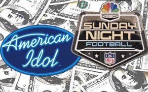
The costliest prime-time show ad space on this year’s schedule is tied between “American Idol” and NBC’s “Sunday Night Football”.  The average cost of running a 30-second prime time  ad in “Idol” runs between $468,100 and $502,900, while the average cost of a 30-second ad in NBC’s much-watched  Sunday Night football contest is $512,367.

While that might sound as if football has trounced the veteran Fox singing program, the tally is relative since “Idol’s” prices tend to go up as the show reaches its finale.  According to an Ad Age  survey,  some spots in “Idol” were going for as much as $640,000.

Other Top Most Expensive 30  second Spots include:

Fox’s “X Factor” is the most expensive new program for advertisers, commanding an average of $320,000 for a 30-second spot for its Wednesday-night run.

Fox’s “Glee,” which commands an average of $267,141

“Family Guy,” which notches an average cost of $264,912

“The Simpsons,” which costs an average of $254,260

CBS’s “Two and a Half Men,” which brings in an average of $252,418

ABC’s “Modern Family,” lures an average of $249,388 per 30-second commercial.

Sunday, filled with football and animated programs on Fox, remains the most expensive night on TV for marketers, as it has for several years. Thursday, once the dominant night, continued its run in second place.

Source: Ad Age

Filed Under: Advertising

Photoshop gone bad!

October 22, 2011

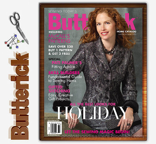
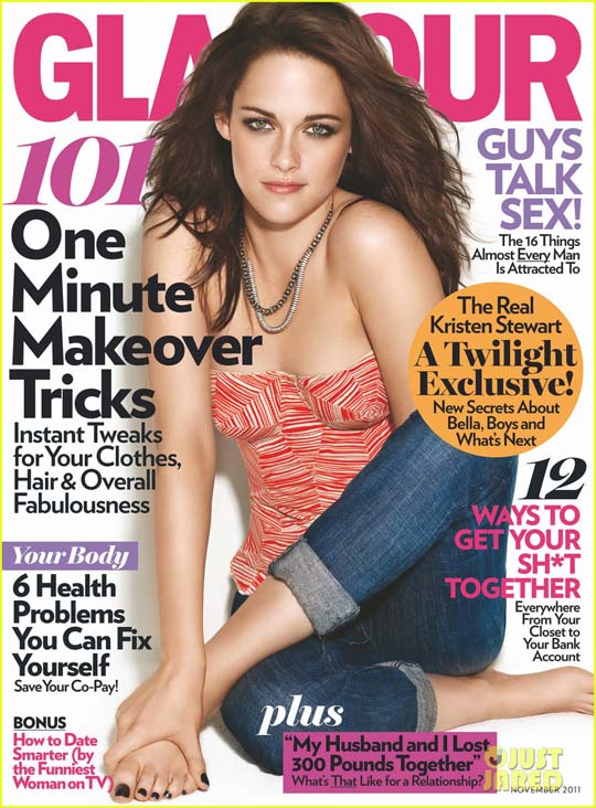
Ok, so we have all seen Photoshop faux pas at the amateur level. But at the professional level is inexcusable. Are we now letting the interns design the magazine covers?

This one was probably done by the folks that did the  John Basedow, Fitness made Simple bad Photoshop work. Come guys, get the actors together the next time, it is a big budget movie!

f Kristen Stewart on the cover of Glamour which has been published on countless sites as a disaster. Did they remove her arm? Is her arm behind her leg or is it behind her back? Your guess.

Here’s more !

This one is from Burberry. Emma can you awkwardly move your leg behind his leg so it looks as though it’s been amputated?

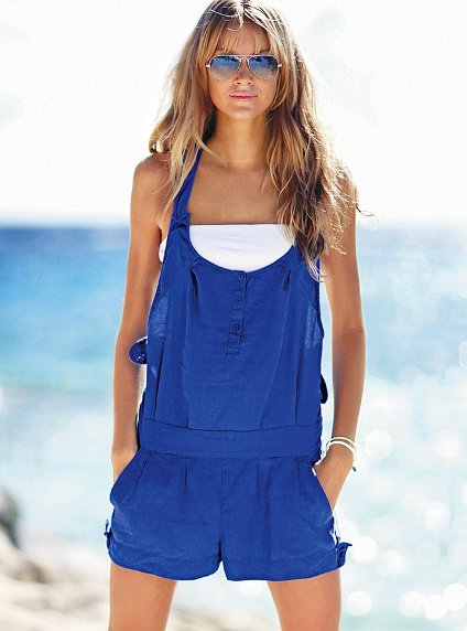
From Victoria Secret – Geez!

This one needs no explanation

Filed Under: Graphic Design

When Psychology meets Design

October 18, 2011

In advertising, nothing is done by chance. Every element chosen, color, photography, typology, smell, or sound for the advertising canvas is placed there for a purpose –  to entice you buy a product.

You could probably say this is when psychology meets design.

Let’s look closer at the use of color in advertising. The colors chosen for an advertisement are more important than the actual wording of the ad. The reason for this is the colors (and graphics) capture the consumers attention then causes them to read your ad. Psychologists have suggested that color impression can account for 60% of the acceptance or rejection of that product or service.

The human brain receives signals faster through eyes rather than ears. Visual appearance is more appealing when compared to any other senses, no matter what the medium of presentation is. This is called the psychology of color which is based on the mental and emotional effects colors can have on people in all facets of life.

Each color has different meanings to different cultures. For advertising purposes, it is extremely important to design your ads in a way that appeals to your target market. Try to choose colors that will compliment the message you are sending to your consumers.

Red

Red is a color that symbolizes action, warmth, power, aggression, excitement, drama, fire, blood, passion, love, danger, anger, and heat. It is a highly visible color that will always attract attention. Red will also stimulate several emotions.

Stop signs have trained us to stop and look when we see red. So it is only natural to want to stop and look at a red billboard.

Studies show that people in casinos gamble more in red rooms than room with any other colors. Red is also a good color for automobiles sales, pasta shops, pizzerias, and restaurants.

However, the color red is not recommended for medical companies because it signals bad health, blood, and emergencies. Red is also the color accountants use to show that they have a negative cash flow.

Orange

Orange is a vibrant and fun color. It improves mental clarity, promotes warmth and happiness.  Contentment, fruitfulness, and wholesomeness are qualities that are also associated with orange.

The color orange can help an expensive product seem more reasonably priced. It is the perfect color for products that appeal to a wide variety of people.

Orange (along with yellow) is an appetite stimulant. Take notice of how many fast food restaurants use the color orange (or yellow)

Yellow

Yellow is a perfect color for sunny, happy, bright, cheerful, playful, easygoing, and optimistic advertisements. Ideal for florists, candy shops, toy stores, amusement parks, and discount stores.

Yellow is the first color the eye processes. It is also the most visible color to the human eye. This is why it grabs attention faster than any other color.

Yellow is also a color of caution. Most yellow road signs are warning drivers of a problem in the road or with the oncoming traffic. This is just another reason why yellow grabs our attention quickly.

Green

Green symbolizes life, nature, environment, youth, money, renewal, hope, and power. It is a color that soothes people, reduces pain, and makes us feel safe.

Since green traffic lights have conditioned us to go forward or to enter places, it makes us feel welcomed. This is a great quality for any product or service.

Yellow-green is not a wise color for food advertisements because it is an appetite depressant.

Light green calms people. That is why most walls in jails, schools, waiting rooms, and hospitals are light green.

Green is a great color for financial advisors, banks, and accountants because it signals money. It is also good for outdoor products because it gives consumers a natural outdoor feeling. The color green can be used for green houses, vegetable stands, landscaping, and farmers because it signals life.

Blue
Blue makes people feel calm, relaxed, tranquil, peaceful, wise, loyal, and trustworthy. It helps people accept themselves and resolve their problems.

The color blue also helps increase productivity.

On the other hand, the color blue can also symbolize sadness, and depression. Since most foods are not blue, the color blue is an appetite suppressant that can help people lose weight!

Blue is definitely the most popular color of both men and women. Several well-known corporations use blue in their logos. It is a great color choice for travel agencies, doctors offices, pharmacies, medical suppliers, motels, psychologists, and weight loss centers.

Purple
Purple is a sophisticated, creative, luxurious, and wealthy color. It is also associated with royalty. A bluish shade of purple tends to create mystery, while a reddish shade of purple is sensual, and creative. Purple with a red tint will get more attention. It is a great color for artists, elaborate restaurants, clothing stores, book stores, art galleries, night clubs, magicians, photographers, country clubs, golf courses, jewelry stores, beauticians.

Brown
Brown symbolizes coffee, lumber, and earth-tone products. It is a reliable, solid, strong, mature, and comfortable color. Brown is now considered a rich and robust color.

The color brown is an excellent color for hardware stores, coffee houses, craft shops, herbal shops, health food stores, male clothing shops, cabinet shops, western stores, contractors, clock shops, and carpenters.

Black
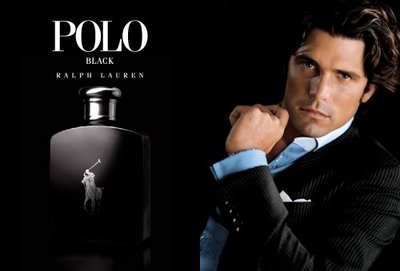
Black symbolizes power, prestige, elegance, style, reliability, simplicity, and sophistication. The color black is more about attitude than anything else. It is a trendy color that keeps consumers up to date with technology. It is also a very informative color.

Black used to be viewed as the color of death and evil. However, this perception is declining.

Black is also a great color choice for music shops, accountants, lawyers, electronic stores.

White
White symbolizes purity, cleanliness, virtue, innocence, and freshness.

The color white is a great choice for bridal shops, weddings, religious groups, daycare centers, medical facilities, wineries, dentists, catering companies, bakeries, museums, historical sites, bed and bath shops, dry cleaners, and cleaning services.

Be careful, however, because white is also a color of death and mourning in China, Japan, and other Middle East countries.

Once you have selected the right color(s) for your design, be sure to find out what colors effectively compliment your color choice.

Next time you are in a grocery store, fast food chain, department store or jewelry store take note of the colors you are presented with and see if you can determine why they were used.

Now go back and take a look at our ad at the begining of this post. Can you explain why this color scheme was chosen?

Filed Under: Graphic Design

Dont hide it, bring it

October 17, 2011

Passion is important.  Passion is believing!  If Passion is evident in what you do,  your fans  or consumers will immediately be able to  tell the difference between a product that is passionately created  or a performance that an artist performed with passion versus the one that was not.

Sometimes truly passionate people try to hide their passion. They are afraid of being misunderstood, of hurting their chances at success rather than helping them. They feel alone… their passion doesn’t make them interesting, it limits them, isolates them.

Don’t hide it! Yes, being truly passionate means that you will likely stand out in a crowd. So what? Bring it! The world needs passion of the good kind desperately.

When you love what you do, everything you touch becomes more special. There is more attention to the details. It should not  always be just about the money,  It should be about  your brand meaning something more.  For true brand sustainability, more than the “one hit wonder,” money should be the consequence, not the goal. Passion is the key building block of success. It’s what separates the truly great brands of today’s marketplace, i.e., Google, Apple, BMW, from the rest. It was passion that made them popular. And it is passion that will drive your successes too.

Passion is infectious, garners a loyal following, produces quality products and services and gives you resilience in the face of adversity.

After passion, if we had the pinpoint the next most important ingredient to success, it is People. If you surround yourself with the best people who share your passion, respect their talents, inspire them  to grow and contribute, foster trust, then you have, what we feel is the second most important ingredient to success.

To conclude, here is a brief  video of Steve Jobs  whose passion and success was undeniable.

http://youtu.be/KuNQgln6TL0

Filed Under: Management Insights

Photoshop Tip of the Week – History Snapshots

October 16, 2011

As designers we tend to do a lot of experimentation during the creative process with our projects. Let’s say you have a project near completion but you want to try a few extra filters or adjustments to see how it would look, but you might not be happy with the results and want to revert back to where the piece is currently.

Here is a slick way to accomplish this without having to delete or hide layers which could get messy and confusing.

Before starting your experimentation simply click the small camera icon at the bottom of the history palette. This creates a snapshot of the document’s current state within the History Palette. You can create as many snapshots as you want to compare the artwork at different states.

Important!

Snapshots are not saved with the document. They only work within the current work session, so be sure to save your artwork at the desired snapshot before closing.

Filed Under: Graphic Design

  • « Previous Page
  • 1
  • …
  • 18
  • 19
  • 20
  • 21
  • 22
  • …
  • 54
  • Next Page »

Delivering Customer Experience Excellence

Let's give em' something to talk about!

Contact Us

Copyright © 2025 · Archimedia Studios · Privacy Policy