Archimedia Studios

  • Home
  • Our Company
  • Expertise
  • Blog
  • Contact Us

Photoshop Tip of the Week – History Snapshots

October 16, 2011

As designers we tend to do a lot of experimentation during the creative process with our projects. Let’s say you have a project near completion but you want to try a few extra filters or adjustments to see how it would look, but you might not be happy with the results and want to revert back to where the piece is currently.

Here is a slick way to accomplish this without having to delete or hide layers which could get messy and confusing.

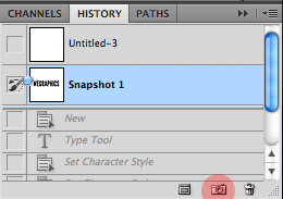
Before starting your experimentation simply click the small camera icon at the bottom of the history palette. This creates a snapshot of the document’s current state within the History Palette. You can create as many snapshots as you want to compare the artwork at different states.

Important!

Snapshots are not saved with the document. They only work within the current work session, so be sure to save your artwork at the desired snapshot before closing.
Filed Under: Graphic Design

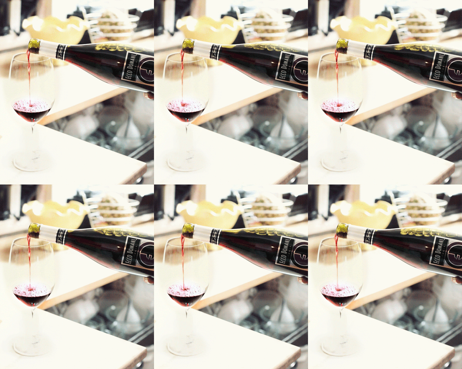
Is it an image or video? No it’s a Cinemagraph

October 12, 2011

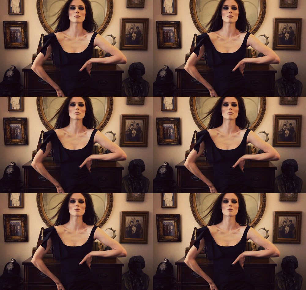
Cinemagraph is a technique of blending the effects of images and videos.

Essentially it’s a sophisticated and refined version of creating animated GIF’s with an artistic goal A big step from the dancing bunny and flashing lights that use to prevalent on websites a few years back. It was introduced by a New York fashion photographer Jamie Beck, in collaboration with motion graphics designer Kevin Burg.

In an upcoming post, we’ll tell you how to make one…check back!

Filed Under: Graphic Design

Thursday’s Tips – Reclaiming Photoshop Real Estate

October 6, 2011

FULL SCREEN PHOTOSHOP

This is one of those shortcuts that once you know it, you may find yourself using it all the time

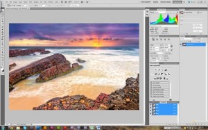
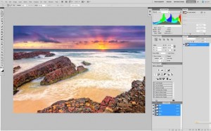
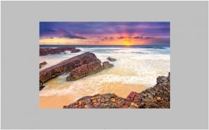
By simply pressing the F key inside of Photoshop you can cycle between Standard Screen Mode, Full screen(with menu bar) and Full Screen Mode – as seen below.

STANDARD SCREEN MODE

FULL SCREEN (WITH MENU BAR)

FULL SCREEN MODE

Full Screen (with menu bar) hides the start bar (on Windows) and desktop wallpaper (on Mac). This is useful for two reasons:

  1. You have more room to see/edit your photo
  2. The neutral grey background is better for making colour corrections or decisions relating to brightness and contrast

Full Screen Mode hides all tools, windows, start bars and desktop wallpapers so that you can concentrate on your image. This screen mode typically uses a black background however tr ychanging this to grey so that it doesn’t affect how you perceive colour and contrast. You can do this in the preferences menu.

SHOW and HIDE PALETTES

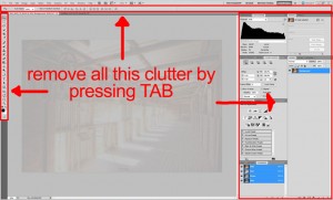
The TAB button on your keyboard is a shortcut that toggles between showing or hiding the palettes, tools and options toolbar. It’s a simple and fast way to remove the clutter and get right into the action.

This shortcut is especially useful when zoomed in and doing high level retouching with the brush or clone tools because it gives you a larger area of the screen to work within. It is even more useful if you know other shortcuts because it means you can stay in this viewing mode without having to keep returning to the other windows.
Shortcut

  • WIN: Tab
  • MAC: Tab

BUT DID YOU KNOW?

You may be saying that you knew that one already. But did you know that Shift + TAB is the shortcut that only hides the windows or palettes on the right hand side of the screen?  So if you find that you don t need to access them all the time but still want to keep the tools and toolbox options available then Shift + TAB is the shortcut for you.

Filed Under: Graphic Design

Work those Lines!

September 27, 2011

In Design, you should always be encouraged to take a good look at the  lines in a photograph that you’re trying to combine with text and graphics.

Repetition is one of the most important design principles and this is a natural implementation of that idea. By analyzing the photo and following its directionality, you sometimes can find incredibly easy ways to make your graphics and text look truly integrated, as if the image was created expressly for the purpose you’re using it for, a great illusion !

The first step using the lines in a photo is to analyze the image’s content and use any hard lines to help align your artwork in a very literal fashion.

It is important to note that not every image will lend itself to the technique. However, learning to be more aware of how the existing content in a photograph can be used to guide and inspire you to create unique designs that break away from the cookie cutter mold that’s so easy to fall into.

Let’s take a look using first,  some easy analysis

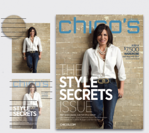
The bricks in this photo form natural blocks. Headlines are set conventionally and stacked, making complimentary blocks.

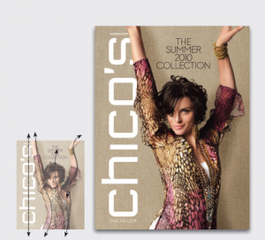
Next , a long tail blouse, plunging V-neck, and a sweeping, fluid pose yield a beautiful sleek top-to-bottom line which gets amplified by the vertical nameplate.

www.chicos.com

Lastly, we’ll be using a method that’s very similar to the repetition methods above, but in a more complex manner.

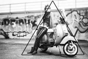
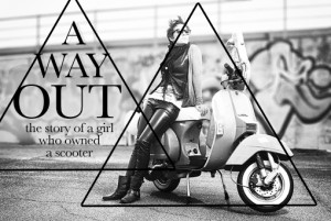
If we think about the strongest natural lines in this photo (below), they don’t really stretch across the image like those in the previous examples. Instead, we see a very defined pyramid take shape.

We can use this shape as inspiration for how we place our text on the page, just as we did with the bird photo. To do this, draw the lines that make up the triangle, then copy that triangle and place it in the area to the left. Finally, use this new triangle as a guide for text placement.

Notice that, in the final result below, we didn’t actually continue the pyramid shape all the way to the bottom. Instead, my lines of text seemed to naturally conform to an almost diamond shape, and that’s completely acceptable. Once again, you’re making the rules here so feel free to distort and rethink the natural lines in the photo rather than simply taking them so literally.

Photographs by Daniel Zedda

Filed Under: Graphic Design

You’ve Got to be Kidding Me!

September 18, 2011

If you work in the design business long enough you are going to have many crazy encounters with prospective clients. Here are just a few that beg the question to be asked;

“You’ve Got to be Kidding Me!”

We need to point out that these quotes came from “prospective clients” and needless to say they were never accepted as clients! There is an old saying. ” some business just ain’t worth it!”

  • We need our website to work regular business hours; from 9 am to 5pm, Monday to Friday.
  • If we hire your firm,  I’m going to have my daughter give final approval. She’s got a good eye for this stuff and she just did the cover for her high school’s yearbook…
  • Prospective Client (CEO): Our product is going to revolutionize this industry, and we want your firm to work with us.

Us: Great! Can you tell me what differentiates your product from the competition?

Prospective Client (CEO): Certainly, I will have my people get back to you with an answer.

  • Our CEO will be in town tomorrow so if you could get the design done by then that would be great.
  • Prospective Client: “I want it to be like Facebook”

Us: “Did you have a budget in mind for this project?”

Prospective Client: “I need to get it done for under $500

  • I need you to make black and white packaging prototype but include as much color as possible.
  • We’re looking for a high-exposure design firm for our product. We want a minimum of 5 prototype designs to choose from. I can only afford a one-time $250 payment upon completion,  however,  it’s a great way to add a fun, popular business to your firm’s clientele.
  • We have no budget for this ad, but the good news is that we are definitely sure that we want to work with your firm.
  • Your hourly rate is okay, as long as you don’t need more than an hour. And you can show me how you did it so I can do it on my own next time.
  • Make sure it’s not too edgy, not too flashy, not too much detail, not classical/traditional, not too complex, exciting, but not  all over the place, efficient but fun, clean, fresh, modern, up beat, contemporary, high readability, smooth, shapeless, timeless, not outdated, but simple.


Filed Under: Graphic Design

  • « Previous Page
  • 1
  • 2
  • 3
  • 4
  • 5
  • …
  • 12
  • Next Page »

Delivering Customer Experience Excellence

Let's give em' something to talk about!

Contact Us

Copyright © 2025 · Archimedia Studios · Privacy Policy