Archimedia Studios

  • Home
  • Our Company
  • Expertise
  • Blog
  • Contact Us

Our 2011 Picks for Best / Worst Movie Posters

December 21, 2011

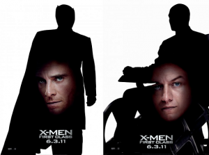
Worst: X-Men: First Class

As far as misguided ideas are concerned, those for X-Men: First Class are in a class all its own. Matching quality to what a ten-year-old fiddling around with Photoshop  could turn out, these look like they were literally whipped up overnight. If the artists who conceived this posters weren’t reprimanded then we don’t know what the design profession is coming to.

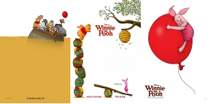
Best: Winnie the Pooh

The movie poster design continues to insult our creativity with either “talking-head” or terribly Photoshopped posters. While there was some graphically pleasing posters this year such as; “Don’t be afraid of the Dark”  and “Little Red Riding Hood”, we chose as our favorite,  Winnie the Pooh. We feel that these posters capture the essence of design, “less is more” and convey an innocent simplicity. Winnie the Pooh’s posters are minimalist, vibrant and perfectly encapsulate the charm and nostalgia associated with that lovable bear. They communicate!
Filed Under: Graphic Design

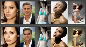
Was it Photoshopped? We may know soon.

December 14, 2011

Can you enhance my look just a tiny bit? Can you shed off my love handles, make my thighs look leaner, make my eyes pop, clear all those wrinkles, and perk up my boobs. These are the most common requests when we do a  celebrity or model photo-shoot.

The photographs of celebrities and models in fashion advertisements and magazines are routinely buffed with a helping of digital polish. The retouching can be slight — colors brightened, a stray hair put in place, a pimple healed. Or it can be drastic — shedding 10 or 20 pounds, adding a few inches in height and erasing all wrinkles and blemishes, done using Adobe’s Photoshop software, the photo retoucher’s magic wand.

Well, soon you may be able to tell what was altered on these photographs, thanks to Hany Farid, a professor of computer science and a digital forensics expert at Dartmouth. Dr. Farid and Eric Kee, a Ph.D. student in computer science at Dartmouth, are proposing a software tool for measuring how much fashion and beauty photos have been altered, a 1-to-5 scale that distinguishes the infinitesimal from the fantastic. Sort of like Photoshop CSI.

Their work is intended as a technological step to address concerns about the prevalence of highly idealized and digitally edited images in advertising and fashion magazines. Such images, research suggests, contribute to eating disorders and anxiety about body types, especially among young women.

The Dartmouth research could be “hugely important” as a tool for objectively measuring the degree to which photos have been altered.

The tool isn’t trying to demonize Photoshop or prevent creative people from using it. But if a person’s image is drastically altered, there should be a reminder that what you’re seeing is about as true as what you saw in ‘Avatar,’ the science-fiction movie with computer-generated actors and visual effects.

If/when this software tool materializes, the following may be 5 great uses for the new Photoshop detection tool.
1. Online dating sites. The guy looks way too hot. Let’s see if he’s had a little help with the airbrushing wand.
2. Beauty ads. How well does that mascara or cellulite cream really work, and how much of it is retouched? Now we’ll know if the desired effect is unattainable. (On the other hand, the jig is up if you’ve gotten rid of red eye. And red pimple. And crows feet. And muffin top.)
3. Retail websites. Do those jeans make that model’s butt look great, or was that the job of a crafty photo editor?
4. Celebrity photos. We may never know which stars have had plastic surgery, but if we know how much their cover photos were airbrushed that’s a start. And then we can stop comparing ourselves to unrealistic images.
5. Facebook. You just KNEW that one girl you went to high school with had been enhancing her album full of glamour shots. Now you finally have proof.

Source: New Yoirk Times.

Filed Under: Graphic Design

Careers for Artists in the Video Game Industry?

November 14, 2011

Are video games works of art? The debate goes on, but there’s no question that art is integral to video games. I can remember my parents saying to me, “Don’t go into art because there is no money in it!”. Well, times have indeed changed, not only is there always need for talented graphic designers in the work force but the gaming industry has opened up new lucrative avenues for artists.

To compete in the $60 billion global video game marketplace, top studios have assembled NFL-roster-size teams of increasingly specialized artists to create blockbuster titles. This  growing demand for high-profile talent has led colleges and art schools to increase the course and degree options for prospective video game artists. In fact, Colleges and art schools have doubled the video game art majors in the last two years, according to The Princeton Review’s survey of schools offering video game coursework and degrees.

As gaming continues to rise in popularity, cross gender and social boundaries, and expand in what defines a gaming experience, artists of all types will be in high demand to provide all the visual elements and quality that consumers expect.

In addition to the creative element, video game artists and animators are well-paid. They make, on average, $71,354, according to Game Developer magazine’s 2010 annual industry salary survey, though not as much as game programmers, at $85,733 on average.

For current blockbuster games, budgeted at $40 million to $60 million, artists are needed to conceptualize environments and characters, create visual effects, add lighting and mesh the art with the game programming.

With rising interest for games, studios will need a constant flow of artists, says Michel Ancel, creator of the Rayman game franchise. “Video games are just at the start of their history, when you compare them to other styles of art,” he says. “Thousands of worlds have yet to be designed, and artists are essential to bring these worlds to life. The story is just beginning.”

Filed Under: Graphic Design

Photoshop gone bad!

October 22, 2011

Ok, so we have all seen Photoshop faux pas at the amateur level. But at the professional level is inexcusable. Are we now letting the interns design the magazine covers?

This one was probably done by the folks that did the  John Basedow, Fitness made Simple bad Photoshop work. Come guys, get the actors together the next time, it is a big budget movie!

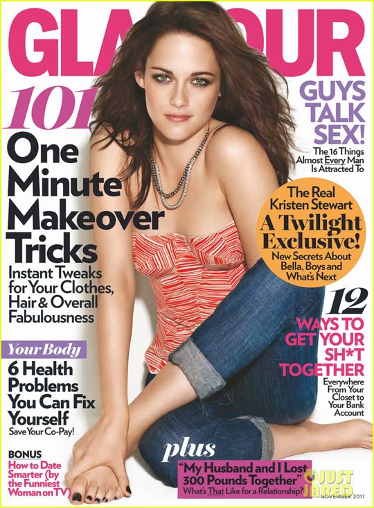
f Kristen Stewart on the cover of Glamour which has been published on countless sites as a disaster. Did they remove her arm? Is her arm behind her leg or is it behind her back? Your guess.

Here’s more !

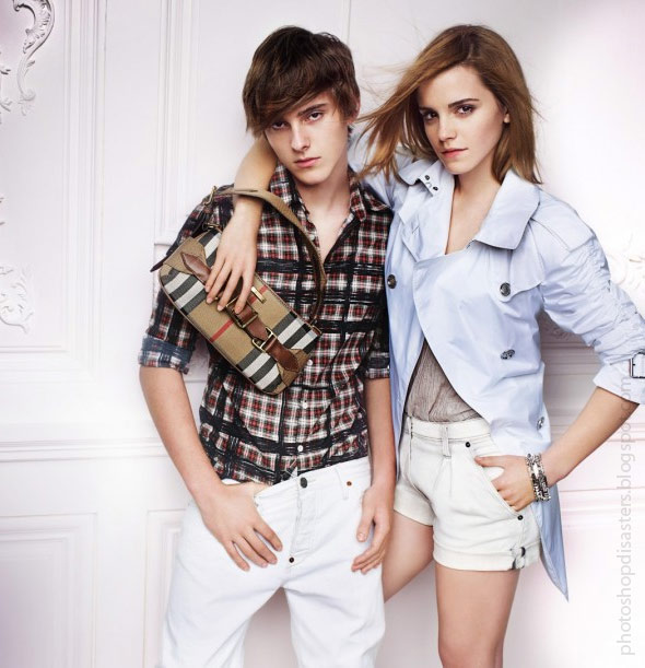
This one is from Burberry. Emma can you awkwardly move your leg behind his leg so it looks as though it’s been amputated?

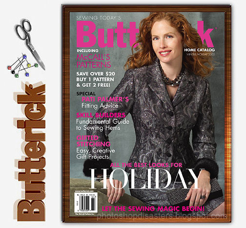
From Victoria Secret – Geez!

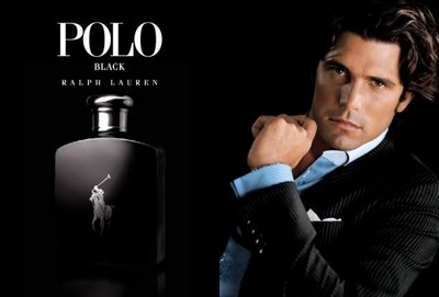
This one needs no explanation

Filed Under: Graphic Design

When Psychology meets Design

October 18, 2011

In advertising, nothing is done by chance. Every element chosen, color, photography, typology, smell, or sound for the advertising canvas is placed there for a purpose –  to entice you buy a product.

You could probably say this is when psychology meets design.

Let’s look closer at the use of color in advertising. The colors chosen for an advertisement are more important than the actual wording of the ad. The reason for this is the colors (and graphics) capture the consumers attention then causes them to read your ad. Psychologists have suggested that color impression can account for 60% of the acceptance or rejection of that product or service.

The human brain receives signals faster through eyes rather than ears. Visual appearance is more appealing when compared to any other senses, no matter what the medium of presentation is. This is called the psychology of color which is based on the mental and emotional effects colors can have on people in all facets of life.

Each color has different meanings to different cultures. For advertising purposes, it is extremely important to design your ads in a way that appeals to your target market. Try to choose colors that will compliment the message you are sending to your consumers.

Red

Red is a color that symbolizes action, warmth, power, aggression, excitement, drama, fire, blood, passion, love, danger, anger, and heat. It is a highly visible color that will always attract attention. Red will also stimulate several emotions.

Stop signs have trained us to stop and look when we see red. So it is only natural to want to stop and look at a red billboard.

Studies show that people in casinos gamble more in red rooms than room with any other colors. Red is also a good color for automobiles sales, pasta shops, pizzerias, and restaurants.

However, the color red is not recommended for medical companies because it signals bad health, blood, and emergencies. Red is also the color accountants use to show that they have a negative cash flow.

Orange

Orange is a vibrant and fun color. It improves mental clarity, promotes warmth and happiness.  Contentment, fruitfulness, and wholesomeness are qualities that are also associated with orange.

The color orange can help an expensive product seem more reasonably priced. It is the perfect color for products that appeal to a wide variety of people.

Orange (along with yellow) is an appetite stimulant. Take notice of how many fast food restaurants use the color orange (or yellow)

Yellow

Yellow is a perfect color for sunny, happy, bright, cheerful, playful, easygoing, and optimistic advertisements. Ideal for florists, candy shops, toy stores, amusement parks, and discount stores.

Yellow is the first color the eye processes. It is also the most visible color to the human eye. This is why it grabs attention faster than any other color.

Yellow is also a color of caution. Most yellow road signs are warning drivers of a problem in the road or with the oncoming traffic. This is just another reason why yellow grabs our attention quickly.

Green

Green symbolizes life, nature, environment, youth, money, renewal, hope, and power. It is a color that soothes people, reduces pain, and makes us feel safe.

Since green traffic lights have conditioned us to go forward or to enter places, it makes us feel welcomed. This is a great quality for any product or service.

Yellow-green is not a wise color for food advertisements because it is an appetite depressant.

Light green calms people. That is why most walls in jails, schools, waiting rooms, and hospitals are light green.

Green is a great color for financial advisors, banks, and accountants because it signals money. It is also good for outdoor products because it gives consumers a natural outdoor feeling. The color green can be used for green houses, vegetable stands, landscaping, and farmers because it signals life.

Blue
Blue makes people feel calm, relaxed, tranquil, peaceful, wise, loyal, and trustworthy. It helps people accept themselves and resolve their problems.

The color blue also helps increase productivity.

On the other hand, the color blue can also symbolize sadness, and depression. Since most foods are not blue, the color blue is an appetite suppressant that can help people lose weight!

Blue is definitely the most popular color of both men and women. Several well-known corporations use blue in their logos. It is a great color choice for travel agencies, doctors offices, pharmacies, medical suppliers, motels, psychologists, and weight loss centers.

Purple
Purple is a sophisticated, creative, luxurious, and wealthy color. It is also associated with royalty. A bluish shade of purple tends to create mystery, while a reddish shade of purple is sensual, and creative. Purple with a red tint will get more attention. It is a great color for artists, elaborate restaurants, clothing stores, book stores, art galleries, night clubs, magicians, photographers, country clubs, golf courses, jewelry stores, beauticians.

Brown
Brown symbolizes coffee, lumber, and earth-tone products. It is a reliable, solid, strong, mature, and comfortable color. Brown is now considered a rich and robust color.

The color brown is an excellent color for hardware stores, coffee houses, craft shops, herbal shops, health food stores, male clothing shops, cabinet shops, western stores, contractors, clock shops, and carpenters.

Black
Black symbolizes power, prestige, elegance, style, reliability, simplicity, and sophistication. The color black is more about attitude than anything else. It is a trendy color that keeps consumers up to date with technology. It is also a very informative color.

Black used to be viewed as the color of death and evil. However, this perception is declining.

Black is also a great color choice for music shops, accountants, lawyers, electronic stores.

White
White symbolizes purity, cleanliness, virtue, innocence, and freshness.

The color white is a great choice for bridal shops, weddings, religious groups, daycare centers, medical facilities, wineries, dentists, catering companies, bakeries, museums, historical sites, bed and bath shops, dry cleaners, and cleaning services.

Be careful, however, because white is also a color of death and mourning in China, Japan, and other Middle East countries.

Once you have selected the right color(s) for your design, be sure to find out what colors effectively compliment your color choice.

Next time you are in a grocery store, fast food chain, department store or jewelry store take note of the colors you are presented with and see if you can determine why they were used.

Now go back and take a look at our ad at the begining of this post. Can you explain why this color scheme was chosen?

Filed Under: Graphic Design

  • « Previous Page
  • 1
  • 2
  • 3
  • 4
  • …
  • 12
  • Next Page »

Delivering Customer Experience Excellence

Let's give em' something to talk about!

Contact Us

Copyright © 2025 · Archimedia Studios · Privacy Policy